Pivot tables in Excel can seem complex, but they’re actually quite straightforward once you grasp the basics. Learning how to use them efficiently can save you significant time. While other methods (like copying, pasting, and creating formulas) achieve similar results, pivot tables offer a more streamlined approach. Plus, they allow you to easily rearrange your data without redoing everything manually.
For instance, consider the example below, which summarizes product sales by person for two years using a PivotTable.
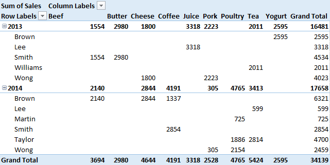
This is just one of many possible combinations. You can create dozens of different ones. I’ll show you how to use pivot tables in the next lessons.
Creating a Pivot Table
You can get most of the pivot tables when you deal with huge amounts of data. But for this lesson, I will use the simple example we used before.
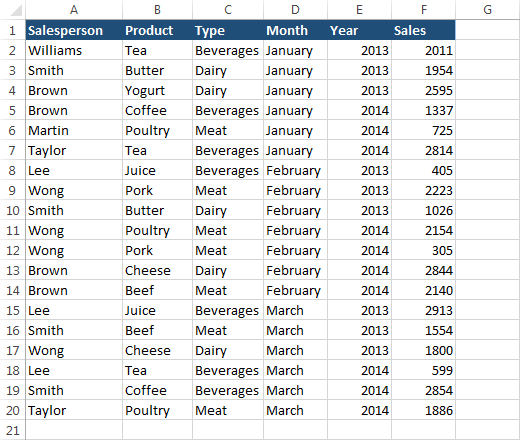
Here, you can find a list of people, products they sell, and categories to which these products belong.
Next columns show the month, year, and the number of sales.
To create a pivot table, first, you need to click one of the cells inside the table. Next, go to INSERT >> Tables >> PivotTable. A new window will appear.
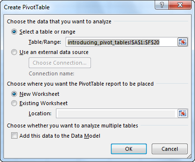
At the top of the window, Excel automatically selected all the cells from the table. If you didn’t click a cell in the table range, but instead you clicked a cell outside, now you need to place your cursor inside the Table/Range text box and select the correct range.
If you selected the range before you clicked the PivotTable button, Excel will, by default select the New Worksheet option.
CAUTION
But, if you selected your range after the Create PivotTable window appeared, Excel will choose the location in the current worksheet. Of course, you can change this option in both cases, but remember this before you click the OK button.
Adding items to a pivot table
The following image shows the pivot table which doesn’t contain any data.
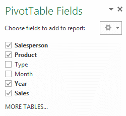
Click it, then add some items from the PivotTable Fields.
Changing the arrangement of items
Change the arrangement of the elements, as shown in the picture below.
This will give you the following result.

In the next lesson, you will learn how to arrange items to achieve the results you want.
Rearranging a Pivot Table
By using pivot tables, you can quickly create a summary table. Besides that, pivot tables also have another huge benefit – they are very flexible. You can rearrange particular items by moving and deleting them to achieve the desired result.
Example 1:
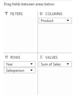
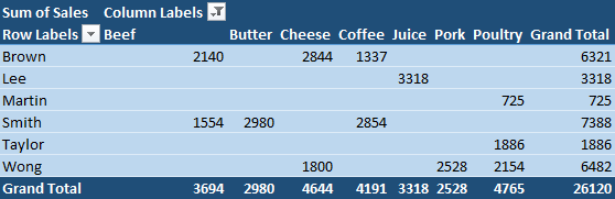
Let’s use the example from the previous lessons to see how we can rearrange particular items.
Let’s switch salespersons with products. With pivot tables, you can do it very easily. Just change the following arrangement:
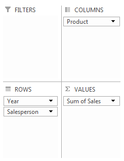
To this one.
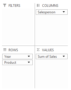
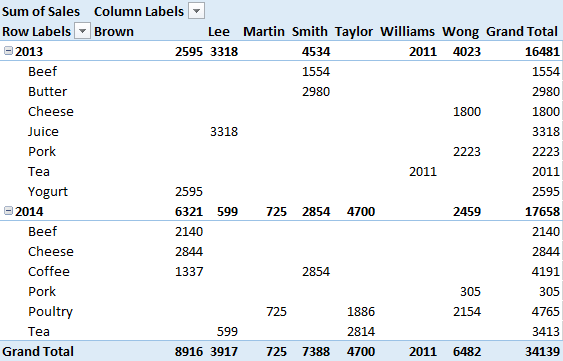
Your new pivot table will look like this.
Example 2
Switching product with the year in rows will give the following result:
Because the Product is above the Year, it becomes the main category. Just Experiment with other arrangements to find out which one suits you best.
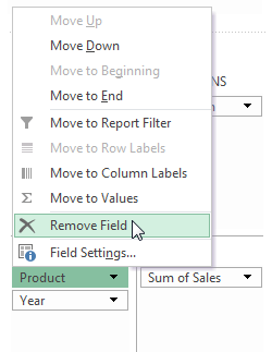
Removing items from pivot tables
You can remove items in two different ways. One of them is to uncheck the items you don’t want to see in the pivot table. When you do this the pivot table will automatically adjust.
In the second method, click an item. A menu will appear. Choose Remove Field to delete the item from the pivot table.
Formatting a Pivot Table
When you need to present your data visually, you can use pivot tables because they are great for this task. But before you do this, you should apply the appropriate formatting. There are a few different ways you can do this.
Styles
The first option is styles. To use them, you need to go to PIVOTTABLE TOOLS >> DESIGN >> PivotTable Styles and choose one from the list.
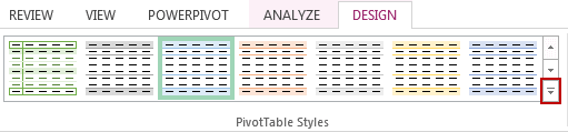
Click the More button to show additional styles. Here, you will find three different categories:
- Light
- Medium
- Dark
After you apply the dark style to your table, it will look like the one below.
Banding
Banding is a pattern of shading alternate rows and columns to distinguish one row or column from the next. For example, the first row might be lighter and the second row darker. This will help you distinguish particular data in the pivot table, especially when you deal with lots of information.
You can find banding in PIVOTTABLE TOOLS >> DESIGN >> PivotTable Style Options >> Banded Rows.
The following example shows banding applied to rows.
Layout
When you work with pivot tables in Excel 2013, you can choose one of many different layouts. Each layout works differently with a particular data, so you can select the one that works best with your table.
To apply the layout to your pivot table, click any cell in the pivot table and go to PIVOTTABLE TOOLS >> DESIGN >> Layout >> Report Layout to display a menu.
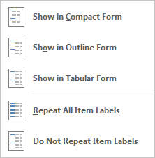
By default, the data is displayed in the compact form. When you change it to the outline form, each product will be displayed in a cell using the same width, so the width of the whole pivot table will be larger. Select Show in Tabular Form to add a grid that separates the cells.
Repeat All Item Labels adds in our example the additional years to each cell.
To remove them- choose Do Not Repeat Item Labels.
You cannot add additional labels when your pivot table is in a compact form.
CAUTION
Recommended Pivot Tables
When you create a new pivot table, you start with the blank one. Then you can choose items you want to show in the pivot table summary.
If you want Excel to decide how to arrange items, you can use the new feature called the recommended pivot tables. This is a collection of predefined pivot tables that Excel “thinks” will suit you best for the particular data.
To create such table, first, click any cell in the range that contains the data you want to use.
After you choose INSERT >> Tables >> Recommended PivotTables, a new window will appear.
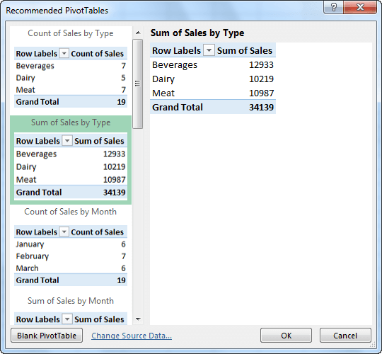
The first position in the list is Count of Sales by Type. This is probably not the one we want because we don’t need the sales to be counted. Look at the second proposition: Sum of Sales by Type. This one is good for our data. If you are looking for something else, choose another position. If none of them works for you, you can select the one that is the closest to your needs and modify it.
Subtotals and Grand Totals
In this lesson, you will learn how to use subtotals and grand totals inside a pivot table.
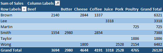
Look at the following example.
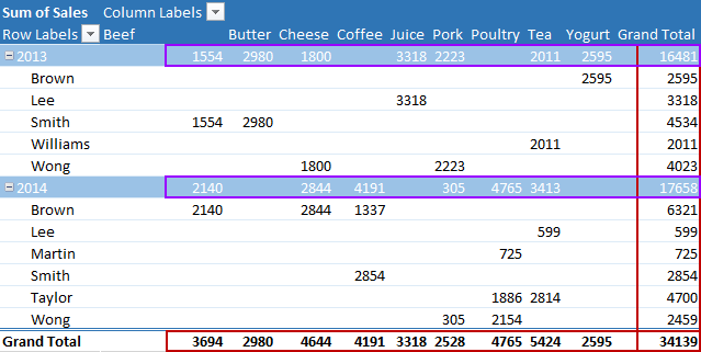
The data that is highlighted in purple shows subtotals, and the one highlighted in red shows grand totals. When you create a new pivot table, this is the default way the subtotals and grand totals appear.
Modifying the appearance of subtotals and grand totals
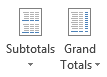
In PIVOTTABLE TOOLS >> DESIGN >> Layout, you will find two buttons, which you can use to control the appearance of subtotals and grand totals.
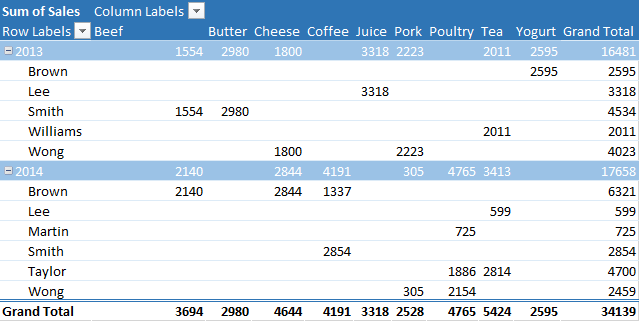
If you don’t like the default position of subtotals you can move them to the bottom of each group. You can also remove them, so they won’t appear inside the pivot table.
Grand Totals
By default, grand totals are displayed both for columns and for rows. You can display them only for columns or only for rows. You can also remove them from the pivot table.
Filtering a Pivot Table
Sometimes when you deal with lots of data you may want to limit, in some way the number of displayed information. With pivot tables, you can do it, using a number of different ways.
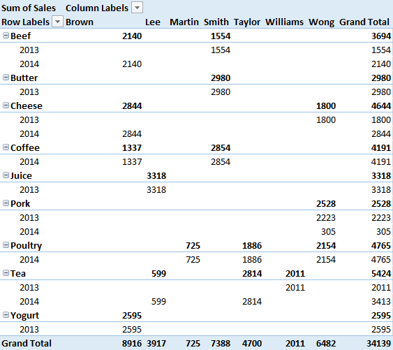
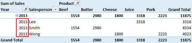
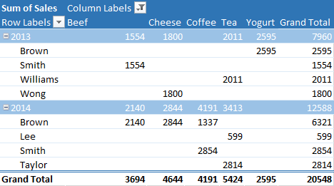
Let’s use the following example. It shows how many items of the particular product were sold by each person in 2013 and 2014.
Selecting items to display
In the first method click a black triangle in one of the fields and hide items you don’t want to see in the pivot table.
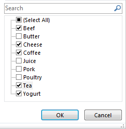
Now, when you click the OK button, Excel will limit displayed products to those you’ve selected. People that sold only products that were unchecked will not be displayed in the pivot table.
Creating a rule-based filters
If you have a lot of information, you may want to create a rule that tells Excel which data should be displayed. Here, you can choose one of the two options: Label Filters and Value Filters.
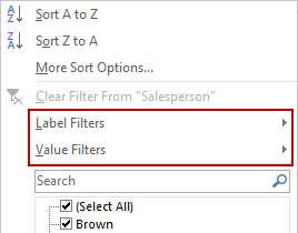
Label Filters
The label filters will set rule on names. For example Beef, Cheese, Coffee, etc.
Value Filters
When you use the value filter rules, you can filter, for example, by the number of sold items.
Excel 365 Update
- Enhanced Recommended PivotTables: Excel 365 offers improved “Recommended PivotTables.” This feature analyzes your data and suggests relevant pivot table layouts based on the content. It utilizes the same technology as the “Analyze Data” feature, making it more intelligent and providing a quicker way to explore your data. (https://techcommunity.microsoft.com/t5/excel-blog/improved-recommended-pivottables-experience/ba-p/3417049)
- Streamlined Field List Experience: The field list in Excel 365 offers advanced functionalities for managing pivot tables. You can search for specific fields, filter the list based on data types (e.g., numbers, text), and even group fields by category (e.g., dates, locations). This simplifies the process of finding and organizing the data you want to include in your pivot table. (https://support.microsoft.com/en-au/office/video-create-a-pivottable-and-analyze-your-data-7810597d-0837-41f7-9699-5911aa282760)
- Sparklines within PivotTables: Excel 365 allows embedding small charts directly within pivot table cells. These sparklines provide a visual summary of trends within the data, offering an additional layer of data exploration without requiring separate charts.
- Calculated Columns: While not entirely new, it’s worth mentioning that Excel 365 allows creating calculated columns directly within pivot tables. This enables performing calculations on existing data and including the results within the pivot table itself.