Usually, when we create a table we use one set of data. But you may find yourself in a situation when it’s not enough. Fortunately, Excel is a powerful spreadsheet, so it can deal with this problem.
We are going to use the following example.

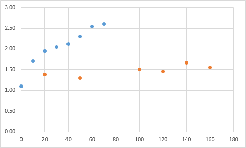
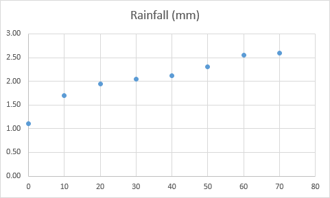
First table
| Time (hours) | 0 | 10 | 20 | 30 | 40 | 50 | 60 | 70 |
| Rainfall (mm) | 1.10 | 1.70 | 1.95 | 2.05 | 2.12 | 2.30 | 2.55 | 2.60 |
Second table
| Time (hours) | 20 | 50 | 100 | 120 | 140 | 160 |
| Rainfall (mm) | 1.38 | 1.30 | 1.50 | 1.45 | 1.67 | 1.55 |
Add two sets of data to a chart
In order to create a chart and add the second plot, follow these steps.
- Click any cell inside the first table.
- Choose Insert >> Charts >> Scatter Chart.
- Click the chart, then click Design >> Data >> Select Data. A new window will appear.
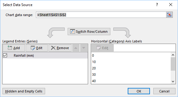
- If you click Edit in Legend Entries (Series) you can see what type of data is there. Copy these values to a text editor.
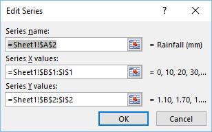
- Click Add to create a new series and enter new data.
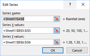
- Click OK inside the edit series, and one more time in Select Data Source.
- This is how our new chart looks like.