Excel, like any other programming language, is perfect for recognizing and using patterns. It is, as well, a great tool for the virtual representation of the data.
We will show both of these things in the example of the y = mx + c function.
Plot y = mx + c in Excel
This is the equation that represents any straight line in which m is the gradient of the line (meaning how steep is the line) and c is the y-intercept (that is the point where the line crosses the y-axis).
This equation is a linear representation of the relation to coordinates of the x and y variables on the line.
Once we put the x value into this equation, we will have a result for y. X is independent, while y is dependent and is determined by x.
Having said all the above, we will create the list of x and list of y values, as presented in the picture below:
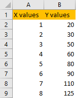
As you can see, with the increase of x values, there is an increase in y values. However, it is not entirely linear. Some formulas can help us calculate their relation.
The first formula is the SLOPE. This formula calculates the m value, i.e. the steep of the line that we will have. To calculate this value for our data, we only need to insert two things in our formula: known y values and known x values. This will be our formula:
|
1 |
=SLOPE(B2:B9,A2:A9) |
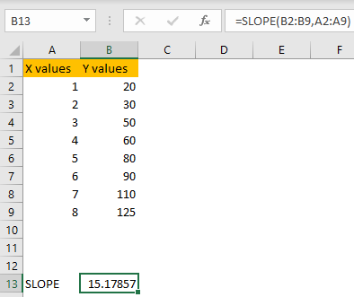
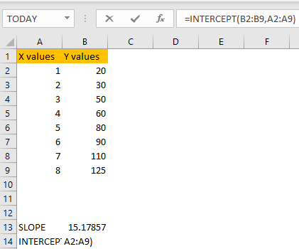
The slope or m value in our range is 15.2, as shown in the picture above. The next thing to calculate is the value of the y-intercept or the value c in our formula. This formula is also straightforward, and it is called INTERCEPT. As same as the SLOPE formula does, it takes into account known y’s and known x’s, and gives us the result:
This is needed for purely mathematical purposes. Now we will show our values on a plot. To do this, we will select our range (range A1:B9), and we will go to Insert >> Charts and choose among Scatter Plots:
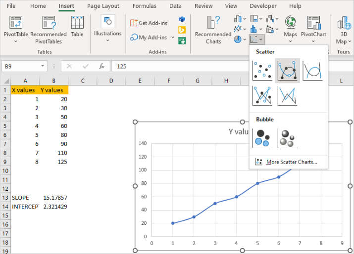
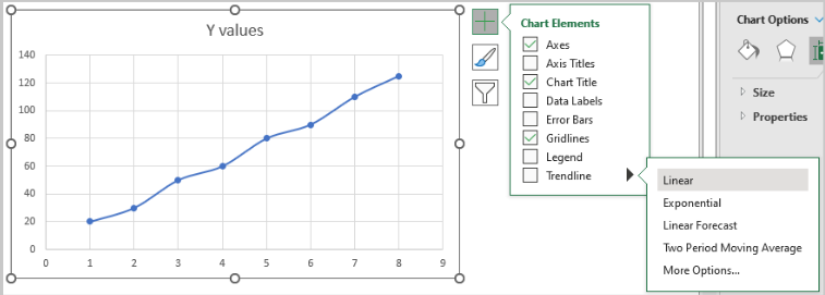
In our case, we will choose Scatter with Smooth Lines and Markers, and we will notice that Excel automatically gives us a preview of our chart. Once created, we will select the Plot, then click on the Plus sign that appears on the upper right, and then go to the last option (Trendline) and choose Linear:
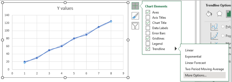
After that, we will repeat this move, and select More Options:
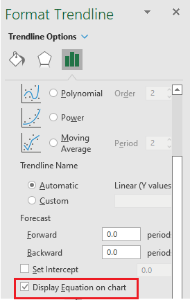
On the right side, we will be presented with the new window, with three options: Fill & Line, Effects, and Trendline Options. We will select the last one- Trendline Options, and then we will scroll down and click on the Display Equation on the chart option:
When we click on it, the equation will be displayed on our chart:
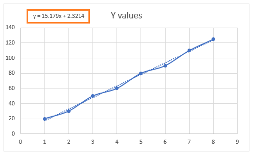
As seen, the slope and the intercept will be displayed on our graph, and the values will be the same as the ones we got in our formulas (the difference is in decimals).