When dealing with charts in Excel, just with everything else- options are virtually limitless. You can customize your data in any way that you want, and along the way, give yourself and whoever uses them, a perfect view of your data.
In the example below, we will show one interesting option in dealing with charts and how we can make our X-axis linear.
Make X-Axis Linear
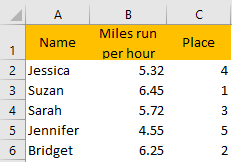
For the exercise, we will say that we have miles run by different participants in an hour’s time and the place they took in the race in comparison with others.
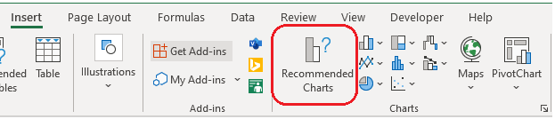
If we go on and select columns B and C, and go to Insert >> Charts >> Recommended Charts:
Once there, we can choose among many options:
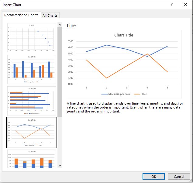
In any of the recommended charts, we do not see any of the options that could show our X-axis linear. To do this, we will have to click Cancel, select data in columns B and C again, and we need to choose XY Scatter chart:
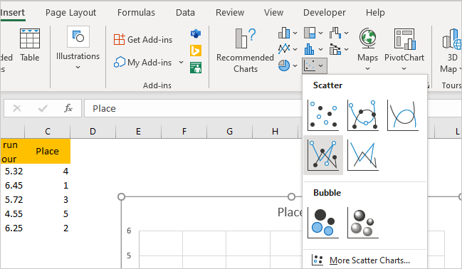
We will go to Insert >> Charts again and choose the scatter ones, as in the picture above. In our case, the best option is to use Scatter with Straight Lines and Markers, which we have chosen above. When we click on it, we will have the following picture:
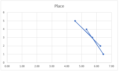
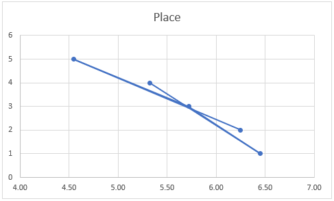
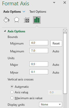
Our data is now shown linearly. To make it even more presentable, we will click on the X-axis and then go to the right-side window. There, we will choose axis options, and then limit the bounds from 4.00 to 7.00 (as our data is in this range):
Once we do this, this is what our chart looks like: