Knowing how to create logarithmic graphs in Excel comes in handy when we want to model situations where we have a very wide range of values: when the decrease or increase in value on one or both axes of the graph is exponential or varied.
A logarithmic graph uses logarithmic scales for one or both axes of the graph. A logarithmic scale is a non-linear scale where each interval increases by a factor that is equal to the base of the logarithm, instead of increasing in equal increments. In this tutorial, we use base 10 logarithms.
If only one axis uses a logarithmic scale, then it is called a semi-log graph. If both axes use a logarithmic scale, then it is called a log-log graph.
When to use logarithmic graphs
Logarithmic graphs are typically used in two situations:
- Where a few values in a dataset are significantly bigger than all the other values. By using a logarithmic scale, it is easier to display the small values on a graph.
- When we want to display percentage or proportional change rather than a raw change in a dataset.
In this tutorial, we will demonstrate how to create a semi-log graph and a log-log graph.
How to create a semi-log graph in Excel
In a semi-log graph, the non-linear logarithmic scale is applied to only one axis, normally the vertical (y) axis. A linear scale is used on the x-axis.
This kind of graph is used when the values on the vertical (y) axis are more varied than the values on the horizontal (x) axis.
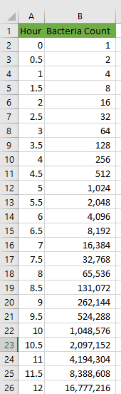
We will demonstrate how to create a semi-log graph in Excel using the following dataset that displays the exponential growth of bacteria over 12 hours.
We will explain this using two main steps: create a scatter chart and change the vertical (y) axis scale to a logarithmic scale.
Step 1: Create a linear scatter chart
We use the following steps:
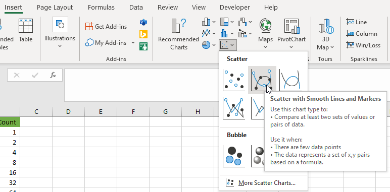
- Click Insert >> Charts >> Insert Scatter (X, Y) or Bubble Chart >> Scatter with Smooth Lines and Markers.
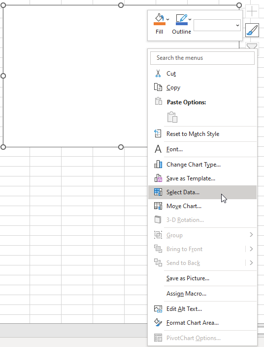
- Right-click the inserted empty chart and click Select Data from the shortcut menu.
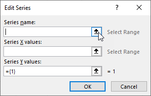
- In the Select Data Source dialog box, click Add in the Legend Entries (Series) area.
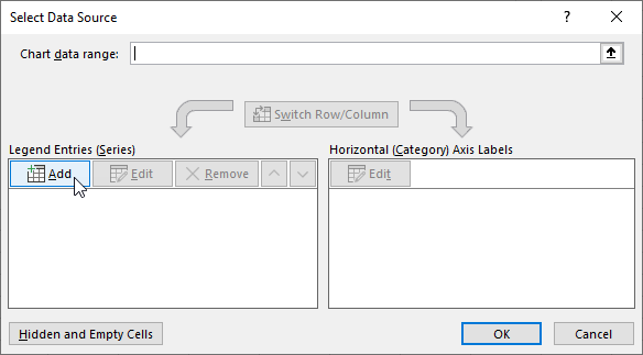
- To give a title to the chart, in the b dialog box, click the up arrow in the Series name box and select cell B1.
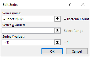
- Click the up-arrow in the Series X values box and select range A2:A26.
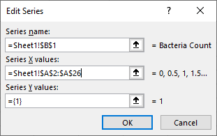
- Click the up arrow in the Series Y values box and select range B2:B26 and click OK.

- Click OK to close the Select Data Source dialog box.
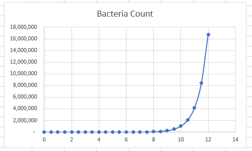
The scatter chart is inserted but it is difficult to make sense of what is happening to the growth of the bacteria until around the 9-hour point. This is because the chart is using linear scales for both axes.
The chart also does not have labels for the axes and a legend.
- Select the graph and click the Chart Elements icon to open the Chart Elements pane.
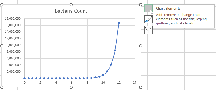
- Check the Axis Titles and Legend checkboxes.
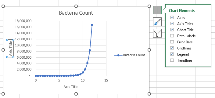
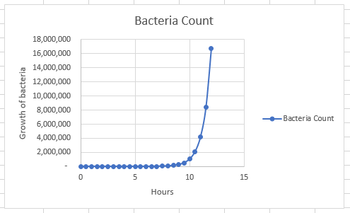
- Rename the x-axis Hours and the y-axis Growth of bacteria:
Step 2: Change the scale of the vertical axis to a logarithmic scale
We use the following steps to change the y-axis scale to a logarithmic scale:
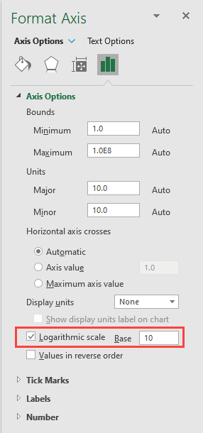
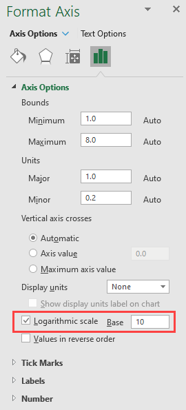
- Right-click the vertical (y) axis and select Format Axis on the shortcut menu.
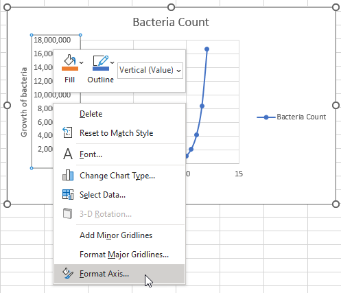
- Check the Logarithmic scale checkbox. Leave the value 10 in the Base box as it is.
We have created a semi-log graph showing the exponential growth of bacteria over time:
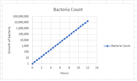
We can see that each mark on the scale on the vertical axis increases exponentially by one (10^0, 10^1, 10^2, and so on)
Using this graph, we can see that there is a linear relationship between time and the multiplication of bacteria.
How to create a log-log graph in Excel
In a log-log graph, both axes use a logarithmic scale.
This type of graph is useful in visualizing two variables when the relationship between them follows a certain pattern.
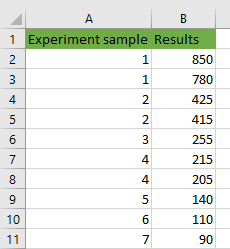
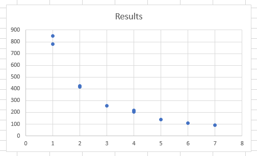
We will use the following dataset of results of an experiment to show how to create a log-log graph in Excel.
We use three main steps in creating a log-log graph: create a scatter chart, change the horizontal (x) axis scale to a logarithmic scale, and change the vertical (y) axis scale to a logarithmic scale.
Step 1: Create a scatter chart
We first need to create a scatter chart. We need to use a scatter chart for log-log data because it is the only chart that allows numbers along the x-axis. Other types of charts use the x-axis for categories, not numeric values.
We use the steps below:
- Select the dataset range A1:B11.
- Click Insert >> Charts >> Insert Scatter (X, Y) or Bubble Chart >> Scatter.
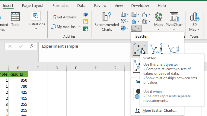
The scatter chart is inserted automatically.
Step 2: Change the horizontal (x) axis scale to a logarithmic scale
- Right-click the x-axis and choose Format Axis on the shortcut menu.
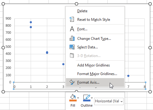
- In the Format Axis pane that is displayed, check the checkbox next to the Logarithmic scale.
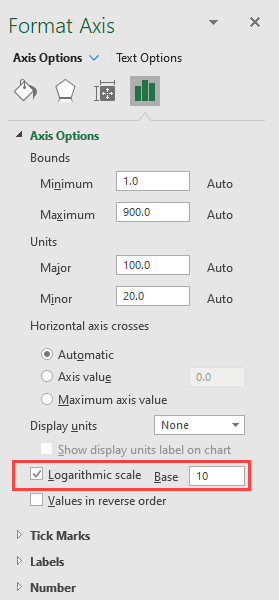
Step 3: Change the vertical (y) axis scale to logarithmic
- Right-click the vertical (y) axis and click Format Axis on the shortcut menu.
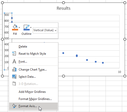
- In the Format Axis pane that appears, check the checkbox next to the Logarithmic scale.
The log-log chart is created.
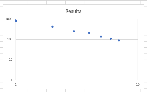
We can see that the x-axis now spans from 1 to 10 and the y-axis is from 1 to 1000.
Conclusion
Logarithmic graphs use logarithmic scales for either one or both axes. A logarithmic scale is a non-linear scale where each interval increases by a factor that is equal to the base of the logarithm, instead of increasing in equal increments.
Logarithmic graphs make it easier to display the few values in a dataset that are significantly larger than the other values. They are also best suited for displaying percentage change rather than a raw change in a dataset.
We have demonstrated in a step-by-step fashion how to create a semi-log graph and a log-log graph.