Sometimes when you want to create a line chart, it doesn’t look the way you want. You want one set of values to be on the X-axis, but it’s still on the Y-axis, even if you click Design >> Data >> Switch Row/Column.
Take a look at the following example.
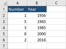
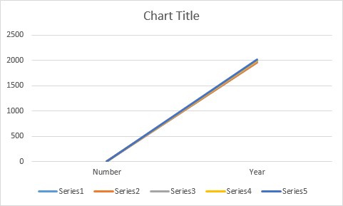
If you click inside the table and navigate to Insert >> Charts >> Line, you are going to get the following chart.
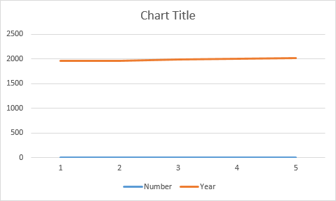
If you switch rows (Design >> Data >> Switch Row/Column), you are going to get the following result.
Not exactly what we wanted.
Instead of using the line chart, we are going to use the scatter chart.
Set X and Y axes
- Click inside the table.
- Navigate to Insert >> Charts >> Insert Scatter (X, Y) or Bubble Chart.
- Choose Scatter with Straight Lines.
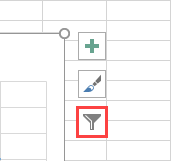
- Click the chart and then Chart Filters.
- Click Select Data ….
- In the Select Data Source window, click Edit.
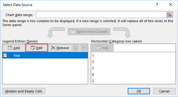
- Switch Series X with Series Y.
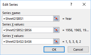
- Click OK to accept changes in Edit Series and then click OK one more time.
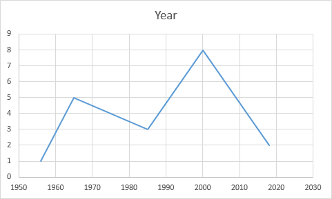
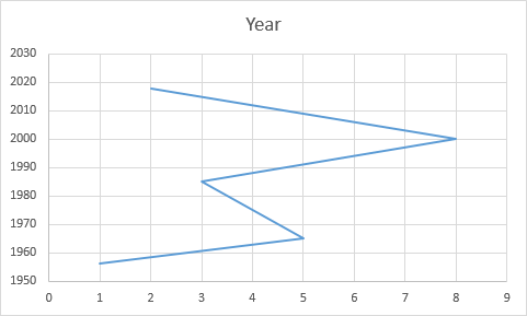
Now, the scatter chart looks like a line chart, with years on the X-axis.