In this tutorial, I’m going to show you how to change data labels on the x-axis in Excel charts. This procedure is a bit different in Excel 365 and other newer versions than it is in Excel 2016 and versions before that.
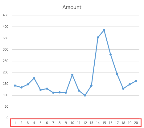
Changing x-axis values with dates
This example shows a chart with the Amount series on the y-axis and the Date on the x-axis.
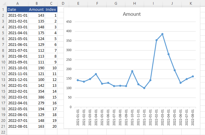
To replace one series with another, you need to have a corresponding data series. In our case, we are going to use the index for months.
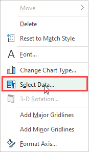
What you need to do now is to highlight values on the x-axis, right-click and from the context menu click Select Data.
Now, inside Select Data Source, you can click Edit inside the Horizontal (Category) Axis Labels.
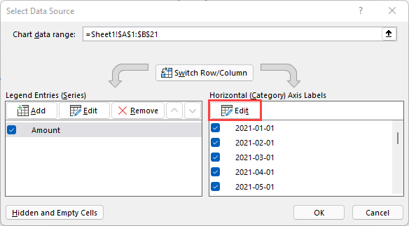
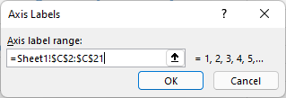
Inside Axis label range, click the up arrow and select range with month indexes (C2:C21), instead of dates. Press Enter.
To the right side of the range, there are the first few numbers from the x-axis. As you can see, the values were successfully modified.
Click OK to close Axis Labels and click OK one more time to close the Select Data Source window.
Now, the horizontal values are changed inside the chart.