A chart is a graphical representation of data. They are an integral part of spreadsheets and were present in spreadsheets even before the first Excel was introduced.
In the previous versions of Excel, charts weren’t very complex but quickly evolved when the new versions of the application appeared. In Excel 365, charts are very powerful and have a lot of configuration options.
You can choose from the several different types of charts: column, line, pie or bar. They allow you to present your data in a clear and pleasing manner.
When you create a chart you will be able to see trends and patterns that could otherwise be unnoticed.
Creating a chart
In Excel 365 you can create charts in several different ways.
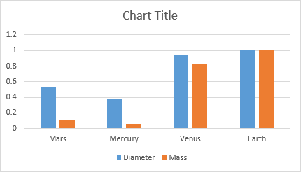
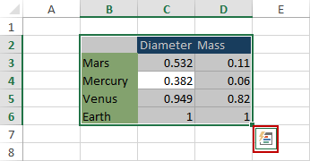
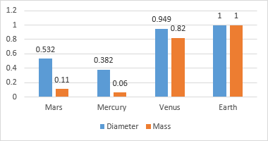
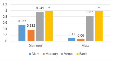
Look at the following example. It shows the mass and diameter ratio of the rocky planets in the Solar System.
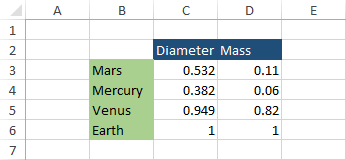
If you want to create a chart from the whole data block, you don’t have to select all these cells- simply click just one cell inside this block and Excel will select the appropriate data. However, if you want to select particular cells, you need to select all the cells which you want to be displayed on the chart.
TIP
The first method
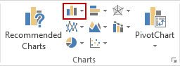
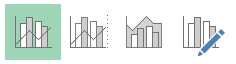
Select the cells you want to display on the chart, then go to INSERT >> charts. Click the first chart, which is the column chart.
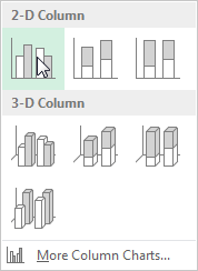
After you click the button, Excel will display a submenu with the column chart variations. Click the first position- Clustered Column Chart.
The chart will appear on the sheet.
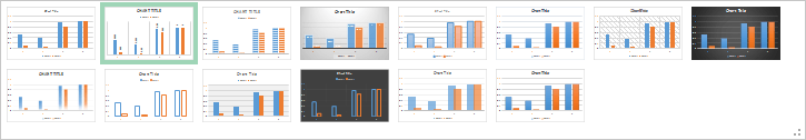
If you want to see how the chart will look before inserting it in the worksheet, hover over the selected type of chart and Excel will create a preview for you. If the chart suits you, you can confirm the selection by clicking on this position.
TIP
The second method
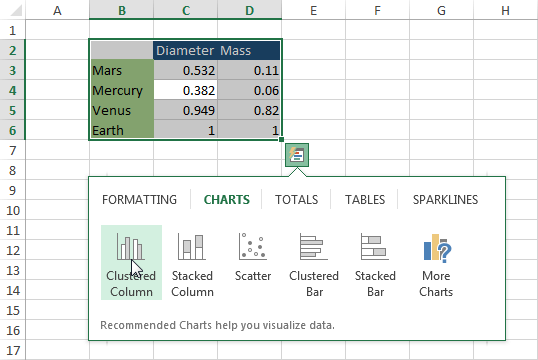
After you select the data you want to use in the chart, the icon called Quick Analysis will appear. Click this icon or use the Ctrl + Q keyboard shortcut.
A menu with various options will appear. Under the CHARTS tab, you will find a few popular chart types.
The third method
The third method is the quickest one. Here, you can create a new chart by using the Left Alt + F1 keyboard shortcut. This method will create a chart instantly, but it doesn’t give you any control over the chart formatting.
Formatting a chart
Microsoft constantly introduces new features and enhancements that are designed to help you work with charts. In Excel 365 you can tweak each component of the chart independently. This means that you can add elements, move them, delete them, and so on.
You can format your charts, by using the ribbon. When you create a chart and then click on it, you will get access to additional tabs: Design and Format.
Design
Add Chart Element
Here, you can add, delete, or change the position of each item in the chart.

Quick Layout
By using this button, you can change the layout of the chart to another one from the list. Layouts differ not only in the arrangement of individual elements but also by the fact that some layouts contain different elements than others.

Change Colors
Here, you can find color compositions: those that use many different colors and those that use variations of the same color.

Chart Styles
This is a place where you can find the different styles you can apply to your chart. When you hover over them, your chart changes its appearance automatically. If you decide to choose one of these styles, confirm your selection by clicking.
Only a select few of the styles are displayed in the ribbon. If you want to display all of them, click on the More button, which is located at the bottom right corner.
Switch Row/Column
On the right side of the Chart Styles, you can find the Switch Row/Column button.

When you click on it, the data from the X-axis will be moved to the Y axis and vice versa. Look at the following example:
And then the same example, after you press the Switch Row/Column button.
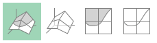
Change Chart Type
If the chart that you chose for your data doesn’t meet your expectations, you can always use this button to change it.

Format
Shape Styles
In the Shape Styles area, you will find tools that you can use to manipulate the chart’s background and gridlines. Besides applying a solid color, here you can also insert a gradient or a picture from your computer or the Internet.
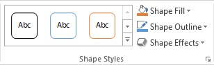
On the left side, you will find Shape Styles. They differ from the standard background color change in that they additionally change the font color, depending on what the actual background color is. When the background color is dark, then the text is white, and when the background color is light, then the text is black.
WordArt Styles
WordArt Styles are used to manipulate text (such as data labels) or title on the chart.
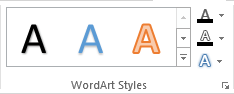
Remember that for some styles the text must be large enough for the effect to be visible.
TIP
Chart formatting shortcuts
When you click a chart, three icons will appear to the right of the chart. These icons are designed to improve your work with charts. All of these features can also be found in the ribbon.
Chart Elements
Some components of the chart, such as titles and axes, by default, appear after you create a new chart. Other elements are hidden.
To access them, click the first button – Chart Elements.
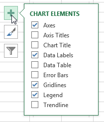
Here, you can select or deselect individual components of the chart. When you hover your mouse over one of them, an arrow will appear. You can click it and choose a place where you want to display a particular object.
Chart Styles
Under the Chart Styles button, you will find two tabs: STYLE and COLOR. These are the same tools you can find in the CHART TOOLS >> DESIGN >> Styles charts. The second tab– COLOR contains the same tools as CHART TOOLS >> DESIGN >> Change Colors.
Chart Filters
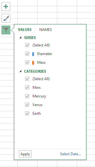
Here, you can select and deselect individual chart elements. After you make these changes, click the Apply button.
Chart types
Charts in Excel first appeared in Excel 1.0 on the Macintosh computers and since then, they have been improved greatly.
When you display data in the chart, it is important to choose the proper chart type. Each chart type displays data in a completely different way and is used for different purposes.
Below, you can find the list of different chart types.
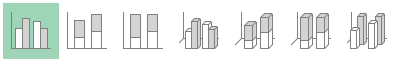
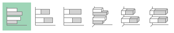
Column Chart
In the column chart, categories are displayed horizontally and values vertically. Column chart works well when you want to compare data sets between each other.
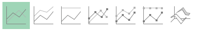
Line Chart
The line chart shows data changes for a certain period of time. In other words, the line chart is good for determining trends.
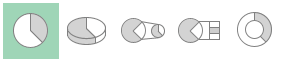
Pie Chart
The pie chart contains only one data series. A series of data in a pie chart is displayed as a percentage of the total.
Bar Chart
The bar chart is similar to the column chart, with the difference being that the data series are displayed horizontally and not vertically. Similar to the column chart, in the bar chart you can compare one or more data series.
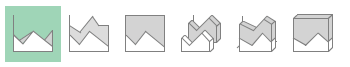
Area Chart
Area charts emphasize the size of changes in time and allow you to focus on the sum of the whole trend. By using the area chart, you can display data that represents the gain in time, in order to emphasize the number of profits.
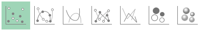
X Y (Scatter) chart
This type of chart is often used to show the relationship between two variables. The Scatter charts are commonly used for scientific and financial data.
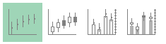
Stock Chart
The stock chart summarizes data on fluctuations in stock prices during one or more days.
Surface Chart
The surface chart is different than the other charts. It shows a three-dimensional surface formed by a set of data points. It is useful when you need to find the optimal combination of two sets of data.
Radar Chart
The radar chart shows changes in the data relative to both the central point and to other data points. This chart type is used to make relative comparisons among objects.

Combo Chart
To highlight the different types of information in the chart, you can combine two or more types of charts. For example, you can combine a column chart with a line chart to make the data more readable.
Excel 365 Update
- Waterfall charts: This chart type helps visualize the cumulative effect of positive and negative values. It’s useful for understanding how different factors contribute to a final outcome. Learn more about Waterfall charts in Excel 365: https://support.microsoft.com/en-us/office/create-a-waterfall-chart-in-excel-365-1643919d-f34b-4429-a998-78449377782c
- Stock charts: This chart type is specifically designed for financial data visualization. It allows you to see trends in stock prices over time. Learn more about Stock charts in Excel 365: https://support.microsoft.com/en-us/office/create-a-stock-chart-in-excel-365-9d0b5340-f34b-4429-a998-78449377782c
- Timeline charts: This chart type helps visualize data points over time. It’s useful for tracking the progress of projects or events. Learn more about Timeline charts in Excel 365: https://support.microsoft.com/en-us/office/create-a-timeline-chart-in-excel-365-16439203-f34b-4429-a998-78449377782c
- Funnel charts: This chart type helps visualize stages in a process and identify bottlenecks. It’s useful for understanding where drop-off points occur in a sales funnel or other process. Learn more about Funnel charts in Excel 365: https://support.microsoft.com/en-us/office/create-a-funnel-chart-in-excel-365-16439198-f34b-4429-a998-78449377782c
- Pareto charts: This chart type helps identify the most significant factors contributing to a total outcome. It’s often used in quality control to identify the 80% of factors that cause 20% of the problems. Learn more about Pareto charts in Excel 365: https://support.microsoft.com/en-us/office/create-a-pareto-chart-in-excel-365-16439208-f34b-4429-a998-78449377782c